Forum:Dark vector theme: Difference between revisions
From Halopedia, the Halo wiki
No edit summary |
|||
| (10 intermediate revisions by 4 users not shown) | |||
| Line 1: | Line 1: | ||
{{Forumheader|Community Proposal|sticky=yes}} | {{Forumheader|Community Proposal|sticky=yes}} | ||
<!-- Please don't remove anything above this line, and put your content under this line. Be sure to sign your edits with four tildes ~~~~ --> | <!-- Please don't remove anything above this line, and put your content under this line. Be sure to sign your edits with four tildes ~~~~ --> | ||
Hi editors! | Hi editors! | ||
| Line 19: | Line 19: | ||
== Comments == | == Comments == | ||
For anyone who wants to see what it looks like before using it, check out [https://i.imgur.com/eCDnarL.png?1 this image].--{{User:Spartacus/Sig}} 17:45, 15 September 2017 (EDT) | <s>For anyone who wants to see what it looks like before using it, check out [https://i.imgur.com/eCDnarL.png?1 this image].--{{User:Spartacus/Sig}} 17:45, 15 September 2017 (EDT)</s> | ||
'''Edit''': Updated examples under feedback section.--{{User:Spartacus/Sig}} 14:17, 17 September 2017 (EDT) | |||
== Feedback == | == Feedback == | ||
{{center|''Any feedback goes here. Includes issues and proposals for improvements.''}} | {{center|''Any feedback goes here. Includes issues and proposals for improvements.''}} | ||
---- | ---- | ||
While I personally love the Orange. Users who have messaged me wonder if the links should follow a "Halo Nation" way of doing it instead and have them blue. Something which is a valid opinion as Halo Nation is considered by many to be our Night theme counterpart.-[[User:CIA391|CIA391]] ([[User talk:CIA391|talk]]) 17:21, 16 September 2017 (EDT) | |||
:Done. Just to point out that that ''Halo Nation'' only caters to one theme whereas ''Halopedia'' is maintaining two themes. Since we don't have a working script that switches the theme on the fly, we have to ensure that the templates work on both dark and default theme. EDIT: When it comes to <s>text/</s>sentences, orange does not work well on white background. A certain shade of blue however does work somewhat better in both white and black background. EDIT2: Attached samples. Which one is more readable? — <span style="font-size:14px; font-family:Arial;">[[User:Subtank|<span style="color:#FF4F00;">subtank</span>]]</span> 14:08, 17 September 2017 (EDT) | |||
::Have to admit, blue links look better and are more readable.--{{User:Spartacus/Sig}} 14:17, 17 September 2017 (EDT) | |||
:::Ok yes Blue is better.-[[User:CIA391|CIA391]] ([[User talk:CIA391|talk]]) 18:30, 17 September 2017 (EDT) | |||
:I'm feeling blue[[User:Editorguy|Editorguy]] ([[User talk:Editorguy|talk]]) 20:58, 17 September 2017 (EDT) | |||
<gallery> | |||
NotSoDark - Orange.png|A shade of orange | |||
NotSoDark - Blue.png|A shade of blue | |||
</gallery> | |||
Latest revision as of 14:25, February 25, 2019
| Forums: Index → Community Proposal → Dark vector theme |
Hi editors!
We are currently rolling out an experiment on a dark theme for the wiki. For now, it is restricted to the wiki's Vector skin. If it works with Vector, the experiment will be implemented on the wiki's default skin (which is called the Nimbus skin).
- If you're interested in testing out this dark theme, simply follow the following steps
- Click here.
- Select Vector and save your changes.
- Copy the code in this page and add in to your own vector.css page. Save thereafter.
For some users, you may need to force your browser to clear their cache to see the changes. The instructions are on your vector.css page.
- Known issues
- Most templates are incompatible with the dark theme: they're ugly for now.
This will be an ongoing experiment. Have fun testing it out! — subtank 14:25, 15 September 2017 (EDT)
Comments
For anyone who wants to see what it looks like before using it, check out this image.--Spartacus Talk • Contribs 17:45, 15 September 2017 (EDT)
Edit: Updated examples under feedback section.--Spartacus Talk • Contribs 14:17, 17 September 2017 (EDT)
Feedback
While I personally love the Orange. Users who have messaged me wonder if the links should follow a "Halo Nation" way of doing it instead and have them blue. Something which is a valid opinion as Halo Nation is considered by many to be our Night theme counterpart.-CIA391 (talk) 17:21, 16 September 2017 (EDT)
- Done. Just to point out that that Halo Nation only caters to one theme whereas Halopedia is maintaining two themes. Since we don't have a working script that switches the theme on the fly, we have to ensure that the templates work on both dark and default theme. EDIT: When it comes to
text/sentences, orange does not work well on white background. A certain shade of blue however does work somewhat better in both white and black background. EDIT2: Attached samples. Which one is more readable? — subtank 14:08, 17 September 2017 (EDT)
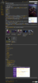
A shade of orange
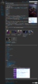
A shade of blue

